My 25 favorite Windows Applications
Here’s a list of my 25 favorite windows applications. They are all open source or free to use. By the way with most Linux distributions you get the functionality those tools provide right out of the box.

7-Zip is an open source file archiver with a high compression ratio. It supports all common archive types. Avast is a free (for personal use) anti virus kit, that protects my system from all those nasty pieces of software out there. Cygwin is an ingenious collection of tools that provides a Linux-like environment for Windows. You can use it with puttycyg to get a very easy to use Linux-like shell with all the tools you miss so badly on Windows. And for those good old DOS games you miss so much there’s DOSBox, the x86 emulator with DOS. Check out a number of old free but totally awesome games you can play on the DOSBox here. For file-transfers there’s FileZilla for FTP and for SFTP there’s WinSCP. And of course there’s everybody’s favorite browsers Firefox and Opera for browsing and ‘being connected’. From what I hear Opera 10 will be out any day now. For my document viewing, editing and creation needs I heavily rely on Texmaker, MiKTeX, GSview and of course OpenOffice.org.
For image creation I just love Inkscape. It has to be one of the greatest open source tools ever created. For graph creation I use gnuplot also I have to say I have been using the graphing tools of MATLAB a lot lately due to ease of use. For text and code editing I use either Notepad++ or Vim. It depends on my mood really. To communicate online I use mostly the cute pidgin universal chat client but I also sometimes log on to IRC using mIRC. For all my media and entertainment needs I have the great and famous VLC media player of course but I tend to use Winamp for audio playback. To download torrent files I use µTorrent and to connect to remote servers I use PuTTY.
I use XAMPP for web development and the ingenious VirtualBox x86 virtualization software for testing on different systems. When my harddrives are a cluttered mess I use WinDirStat to get a hold of the chaos and clean it up. And recently I accidentally deleted files from the SD-Card of my mobile phone and was able to recover them instantly using the awesome Photorec data recovery software.
That’s it for my list. I hope someone out there will find this list useful.
Search, search and communicate!
There’s quite a lot going on in the ever interesting internet search and communication business these days. Wolfram launched its Wolfram|Alpha search engine, Microsoft launched its new Bing search engine and Google demoed its newest product Wave. They also rather quietly released Google Squared. Here’s a graph generated with BlogPulse’s Trend Search showing the buzz these products created over the last month.

I admit the graph is a bit ambiguous and it would be much better to count the number of links in blog posts that link to the respective product. But let’s just assume that the graph is an accurate representation of the buzz those products created.
So Wolfram. I like what they did but have a couple of problems with it. For one I feel like they kind of not understood what it is all about these days. They ignore collaboration, wisdom of the crowd, free knowledge and all that good stuff we have today. But they don’t want that, they want scientific accuracy and control over their content. That’s fine I think but I would have loved to see all those smart people to contribute to a project like Wikipedia or freebase. And maybe they could have dedicated some of their enormous brainpower to finally getting NLP off the ground to provide a nice interface to all the information out there and to establish some ground rules about how we should do NLP.
Bing, well – pretty pictures. That’s really all it is for me personally. The name is certainly better than their Live Search thing but I don’t like the interface at all.
And then for Google Wave: I really hope this product will not succeed and will not revolutionize anything. It’s in the first few minutes of the demo why it would be very scary to have Wave around. Lars Rasmussen says that E-Mail is bad because it’s peer to peer, not very comfortable and whatnot. So he proposes to put the Wave (i.e. Google) in the middle of all that communication. Scary.
What’s really awesome is Google Squared. It’s by no means perfect – still a lot of rough edges – but has a lot of potential. I hope to see some serious work done on that thing and maybe an API for us developers to play with and create new things.
Building a simple ECG Amplifier
A friend and I joined forces to build a simple ECG (or EKG) Amplifier for our Signal Processing class at University of Applied Sciences Regensburg. We searched the web, magazines and books for suitable circuit diagrams and instructions on how to build one. We found that the instrumentation amplifier INA121 (datasheet) was a suitable IC and also the precision instrumentation amplifier AD624 (datasheet) mentioned in this Scientific American article seem to be viable option. However as it turned out those ICs are very hard to come by and rather expensive ranging from about $10 to over $50.
We also found a quite professional solution in Funkamateur, edition 12/93, pages 794-796. The article is in German and can be found here. We found another very simple circuit diagram for an amplifier in Elektor, edition 7-8/2000 that we ended up building. Here’s the diagram:

The components cost about 10 Euro. We built it on two breadboards one for the amplifier itself and one for the power supply. With two 9V batteries connected it supplies -9V and +9V. Here’s a picture of the amplifier board:

Green red and black cables are connected to the power supply, the thick black cables are connected to the subject and at the bottom there are two pins to connect the oscilloscope probe or an AD-converter.
We used real ECG pads from the hospital to collect the signal from the subject. At first we used regular unshielded copper cables to connect the electrodes which resulted in a lot of noise. We then replaced the copper cables with shielded thin microphone cables and connected the shield to ground. This hugely reduced the signal noise. Here’s an image showing an EKG taken with our amplifier:

The electrodes are connected to right hand, left hand and right foot. As you can see it’s pretty much what you would expect. You can see the P-wave, the QRS-complex and the T-wave. We’re quite happy with the results.
If you try to build something like this yourself please be advised that you should be careful when connecting this amplifier to anything that carries high voltage (line voltage). The amplification circuit and measuring devices are not separated from each other. So you should only use battery powered devices like a USB oscilloscopes connected to a laptop running on battery. This is important as you consciously connect the subject to your circuit in a very well conducting manner (because that’s what you want) and at very dangerous points. So you should take care that no high voltages can flow between the electrodes at any time.
Dystopian Movies
I like movies. Who doesn’t. One genre I probalby like the most are dystopian movies; movies in which a very negative future of our world is shown. Maybe a post-apocalyptic world or a society gone bad. Things like that fascinate me. Here’s an incomplete list:

That’s Clockwork Orange, Metropolis, Waterworld, Postman, Brazil, 12 Monkeys, Soylent Green, Blade Runner, Children of Men, Gattaca, Equilibrium, Escape from New York, Demolition Man, The Matrix and of course 1984.
Blog Analysis
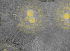
This post lists a couple of more or less random thoughts on blog analysis, data mining, social media analysis and sentiment analysis. I’d like to start out with an interesting graph from blogpulse.com comparing the number of blog posts that talk about the two candidates for U.S. presidency Senator McCain and Senator Obama:

Looking at that graph without thinking about it one might say: well, looks like the democratic candidate is winning. But all this graph shows is that people talk more about Senator Obama at the moment. The graph doesn’t show if the blog posts are positive or negative. One might argue that any attention is good attention but it’s hard to tell from the graph. Additionally I suspect that when writing about the presidential race, chances are both candidates are mentioned. I’m doing it right in this post. So I’m not one hundred percent sure what the divergence of the trends means.
But extracting keywords is only the beginning. What we really want is a tool that is capable of some form of natural language processing. It should to some degree be able to understand the text it is analyzing in order to extract its sentiment or the connotation associated with certain words or phrases. There are numerous experiments in that direction out there, the most prominent being powerset. They got quite a bit of media attention and they were praised as being Google’s successor and then got bought by Microsoft. For the fun of it here’s a comparison of powerset and cuil buzz created with data from blogpulse.com:

Please notice the logarithmic scale on that graph. I guess the point I’m trying to make with that graph is that ever since they got bought it got kind of quiet around the powerset guys. They are probably integrating their technology into Microsoft’s search engine.
Speaking of Microsoft, the Datamining Blog talks a lot about social streams and in particular the politics implementation. From the blog posts and the FAQ I conclude that they are building some kind of platform called “social streams” that is able to mine various social streams, preprocess the data and then apply various analysis algorithms on that data. Very interesting. They don’t want to limit themselves to blogs but really try to cover as many social media streams as possible (think Twitter or Usenet). They probably have some kind of plug-in architecture where they can add new mining components as they see fit. The data might be stored in a generic way, regardless of the source – at least that’s how I would try to do it (don’t know if it is possible). I’m looking forward to what comes out of this.
At the moment they only seem to have the afore mentioned politics application. I don’t like it that much because it mixes “news”, “blogs”, “people” and “places” in a really strange way. It gets its data from news or blogs and it is about people and places. But what are those 4 boxes telling me? Obama: People 9? Is he associated with 9 people and 9 places? The number is probably rather irrelevant. Here’s a graph similar to the first one taken from social streams:

What I’ve been thinking about doing in this area is the following: I’d like to create a simple blog analysis tool that analyzes one blog at a time. I’d like to provide a time line where one can see when and how often a new post was published. It might also be interesting to automatically extract some key words from the blog that might give you an idea what the blog is all about. Kind of what Google AdWords is doing. And finally a trend search engine that allows you to extract how often and when certain keywords are used in the blog. I thought about using the Google Feed API to grab the content of a blog’s feed in a convenient way. They also provide a history of the feeds which would allow an analysis of not only the current feed but a larger time span. If you’re interested in the Google Feed API check out this and this article.
Convertig CSV files to LibSea graph files for CAIDA’s Walrus
Quite a few responses to my posts about social network visualization with Walrus contained questions about how to create the input files for Walrus. Walrus itself is very well documented and the LibSea graph file format is also explained in detail. But people seem to run into trouble when trying to create the spanning tree required for Walrus.

The Walrus documentation states that it only makes sense to visualize data that contain a meaningful spanning tree and that visualizations created with the help of an arbitrary spanning tree are not very useful. While that’s probably true the visualizations still look awesome. And I guess that’s what people want. Furthermore Raffael Marty from secviz.org contacted me and asked if I had a tool that could read CSV files as input and output a LibSea file for Walrus.
I didn’t have such a tool but it sounded like a fun challenge and I thought that such a tool might also help all the people who run into trouble when trying to create a spanning tree for their graphs. So I created walruscsv – a command line tool written in C++ that reads a CSV and outputs a LibSea graph file that can be visualized with Walrus. The CSV file hast to contain a link in each row and consist of 2 columns. The first column in each row represents the first node of the link and the second column the second node of the link. It automatically generates an arbitrary spanning tree.
A sample CSV file containing the links node1<->node2, node1<->node3, node3<->node4 could look like this:
node1,node2
node1,node3
node3,node4
Although Walrus is only capable of visualizing one network at a time walruscsv can handle multiple networks in one CSV file. It creates an arbitrary node and connects a node of each network to that node enabling Walrus to visualize the data. Currently the tool creates an arbitrary spanning tree so it’s not weighted and therefore not minimal.
Walruscsv reads the name of the CSV file to process as the first command line parameter passed to it. It is released under a non restrictive open source license so in addition to binaries the source code is provided. To compile it using the GNU C++ compiler simply type:
g++ wlink.cpp main.cpp wtree.cpp -o walrus.exe
You can use the program by typing
walrus.exe testfile1.csv
whereas testfile1.csv is the CSV file containing the graphs you want to visualize. Bloodshed Dev-C++ can also be used to compile the code and although I didn’t try it it should also work with C++ compilers from Microsoft (e.g. using Visual Studio). Here are the files:
Source code (the source code released to the public domain)
Test files (a collection of test CSV files)
Win32 binary
Debian x86 64bit binary
If you’re having trouble using or compiling the tool or if you have suggestions or comments of if you find a bug feel free to contact me or leave a comment.
Visualization of Social Network Reloaded
Update: I created a tool to convert CSV files to Walrus compatible LibSea files. Check out walruscvs here.
About one and a half years ago I spent a considerable amount of time experimenting with social network visualization. My methods to gather and generate the data for the visualization tools I used were very limited.
However just after posting my first results I stumbled upon the Studivz Statistics page created by Hagen Fritsch who crawled the entire social network within only 4 hours in November 2006. Back then security measures were virtually non existent so it was an easy thing to do. Today the Studivz (which is a German Facebook clone) uses a Captcha to prevent such endeavors.
Hagen Fritsch was so kind as to make the data he crawled available to me. Thanks Hagen! Not all the data, just the relevant pages to determine the connections between users in particular the “Friends” pages. So now after 1 and a half years I found some time to look at the data, analyze it and feed it to Walrus. Some results:
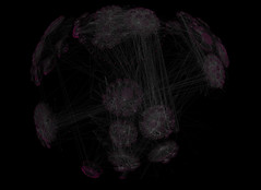
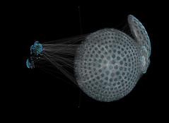
The first graph consists of 17142 nodes and 22838 links whereas 17141 links are part of the spanning tree Walrus uses for rendering. The second graph consists of 25313 nodes and 37794 links. Four levels of the social network are displayed meaning the tree’s depth is 4.

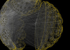
This two images show one of the largest graphs I created: 413193 nodes and 1247702 links with a tree depth of four. The left images only shows the spanning tree and the image on the right shows the entire network. When working with such large networks I encountered a couple of problems.
I was using PHP to create the Walrus graph file. Because of the spanning tree this is no trivial task and it became very clear that PHP is the wrong tool for it. A PHP script ran for about 4 hours to create a 30000 node graph file. I wanted bigger trees so I ported the PHP script to C++ and was surprised to find that the same task took mere seconds. This is not due to inefficient coding but PHP definitely has problems when dealing with huge junks of data especially when they are stored in associative arrays. In C++ I used hash_maps which worked out perfectly. Here are two more images of the above network:

My Celeron 1.7GHz 512MB RAM workstation thought I was being ridiculous when I loaded the 60MB text file that contained the graph into Walrus. After some swapping and heavy calculation it worked reasonably well though.
If you feel like playing around with Walrus and the data here’s a zip file containing the 3 networks on display. You can get Walrus form here. Start Walrus with the following command:
java -Xmx512m -cp mp.jar;antlrall-mod.jar;libsea.jar;walrus.jar H3Main
I added the “-Xmx512m” part to allow java to allocate more memory. This is necessary for the very large graph file. Enjoy! I will try to add a video in the next couple of days. I was also able to extract the university each of the members of the social networks attends so there are a couple of possibilities to create more visualizations.
Chrome Buzz
Here’s my try to create one of the cool trend graphs Matthew Hurst regularly entertains us with. I used blogpulse.com/trend to create the following graph:

Looks like the Chrome buzz easily surpassed the Firefox3 release buzz. Quite impressive. Unfortunately blogpulse’s trend tool allows users only to look 6 months into the past. It would be very interesting to have events such as the release of Internet Explorer 7 or the announcement of Safari for Windows on that graph too.
Random Pixel Tile Map Generator
I found something to do that connects the things that interest me most at the moment: automatically generated game content, number juggling in Matlab, browser games and pixel art. I’m not much of an artist so all I can do regarding pixel art is being astonished about the marvelous things pixel artists are able to do. However being a programmer I thought of a way to circumvent the art part and still create something cool. So the idea is to let the computer create the art by means of a random number generation and some number juggling.
 I wrote a script that creates a pixel tile based map from a random height map and created 6 pixel tiles for the different heights. I wanted water, a beach, nice grasslands and icy mountains. To generate the height map I used Matlab. I tried a couple of different techniques and finally ended up using a perlin noise algorithm.
I also experimented with a simple Gaussian distribution random number generator and tried to fit the numbers to my needs. However it turned out to be ‘too’ noisy as I was aiming for continents and large mountain ranges. The Gaussian distribution however gave me only small islands. I tried to smooth it with different filters which made it a little better but I realized the numbers where fundamentally different from what I wanted.
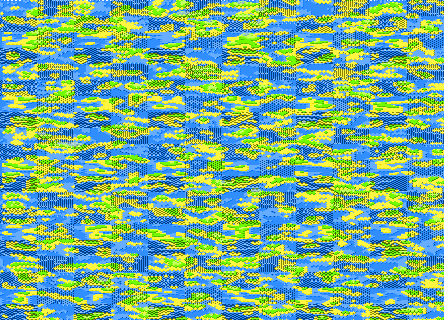
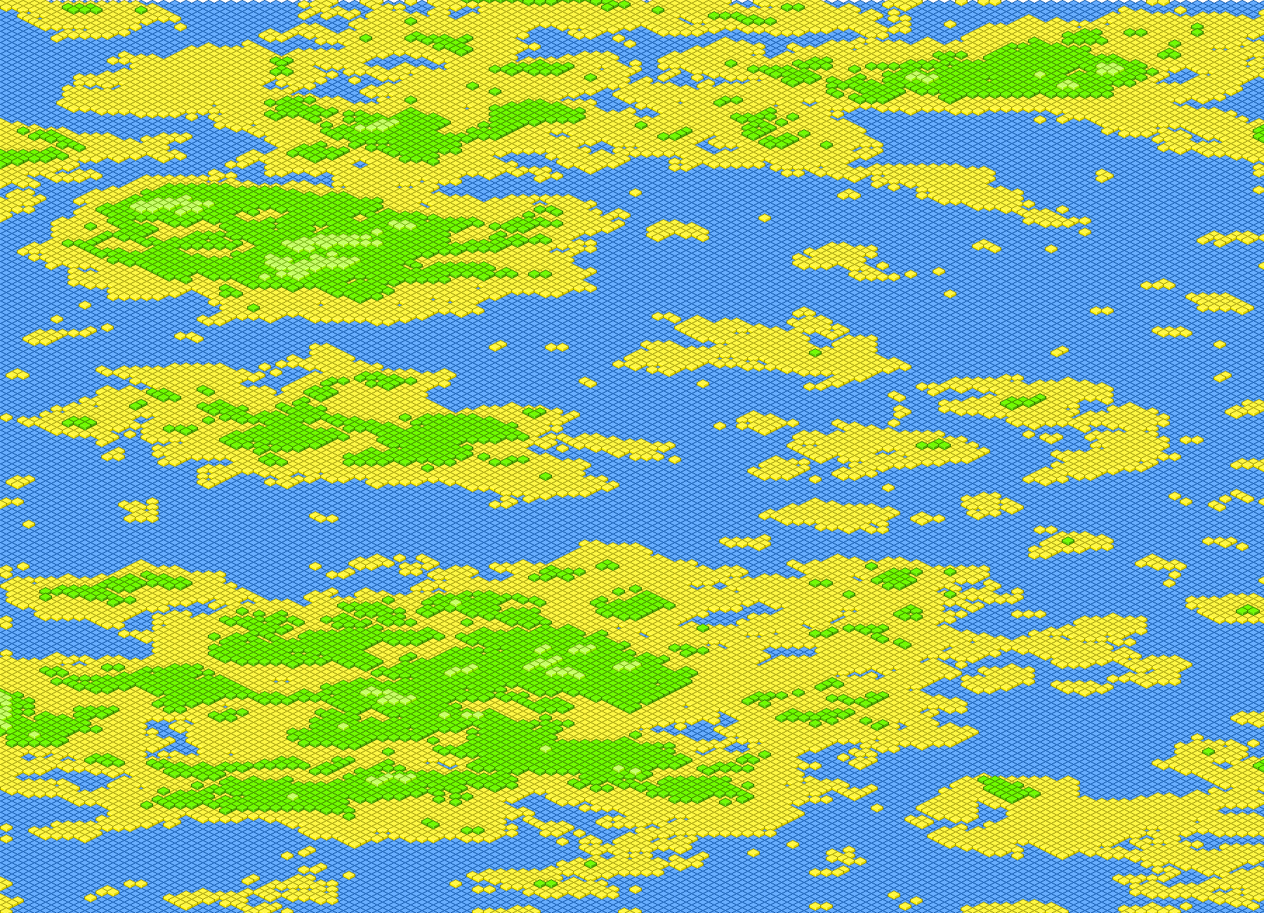
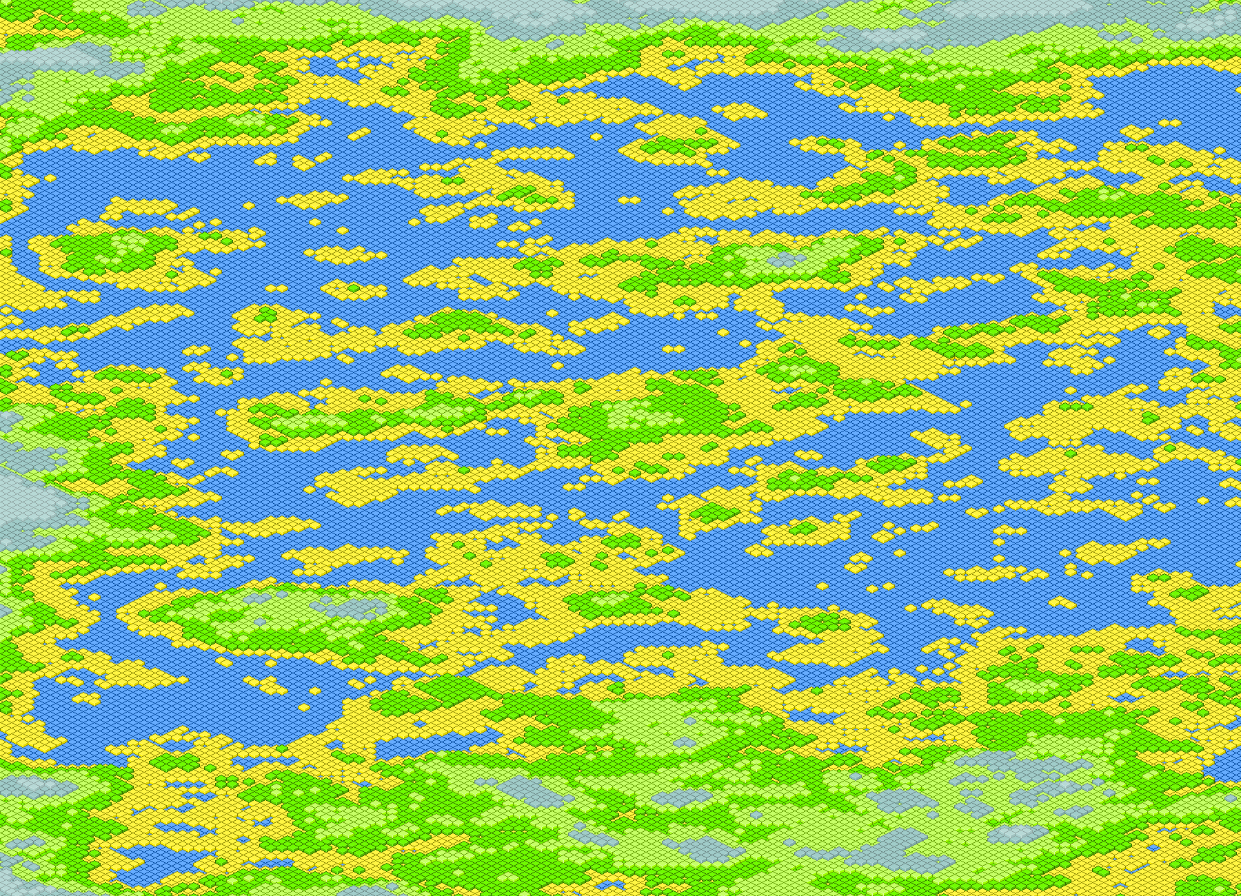
The image on the left is created with Gaussian distribution, the second has a 7×7 Gaussian blur filter applied 3 times and the third one is created with Perlin noise. Go ahead and click on the images to view the full size version. They are quite large so they might take a second to load. I got the matlab code for the Perlin noise generator from Christopher Wellons’ blog post about Noise Fractals and Clouds. He wrote it for GNU Octave, a tool which I have to try out yet. To use it in Matlab only a slight modification was necessary:
function s = perlin (m)
  s = zeros(m);                                    % output image
  w = m;                                 % width of current layer
  i = 0;                                             % iterations

  while w > 3
    i = i + 1;
    d = interp2(randn(w), i-1, 'spline');
    s = s + i * d(1:m, 1:m);
    w = w - ceil(w/2 - 1);
  end
end
Now this looks quite inconspicuous but there’s quite something to those 11 lines of code. The interp2() function recursively expands the matrix returned by rand(w) i-1 times with spline interpolation. This contains the frequency of the the function and the i in the following line represents the amplitude. Quite elegant really! The only thing to criticize about this code is probably that it can’t exploit the fact that Perlin noise can create continuous noise resulting in an infinite world. To do that I guess you need a seeded random number generator. Matlab let’s you save and restore the state of the generator with:
s = randn('state');          %save state to s
randn('state',s);            %restore state from s
which might enable you to accomplish just that. And finally here’s a PHP script that let’s you generate a map based on a height map in a CSV File (sample file). Be warned though: PHP is a very bad choice to do these kinds of things and the script is therefore very slow. A ZIP file containing the PHP script, the test data and the 6 separate pixel tiles can be downloaded from here.
Fourth Prototype
Prototype Updated (see below).
There’s a great old space strategy game called “Ascendancy” (download and play with DosBox). One unique feature of the game is the intriguing 3D map of the universe. It’s from 1995 and now in 2008 such a 3D map can easily be implemented. But I like browser based games so the challenge was to implement the thing inside the browser. Turns out that’s also not very complicated when using the canvas tag supported by Firefox, Safari (Webkit) and Opera browsers. Here’s a warning for Internet Explorer users: the prototype won’t work very well. I’m using Google’s Explorercanvas – it emulates canvas-tag behavior but it is therefor very slow. So please consider using one of the afore mentioned browsers to test it.
Go ahead and start the prototype.
A random universe is created and rotates around the y-axis. You may change the continuous rotation axis, activate and deactivate starlanes, change the number of stars, change the size of stars, change the number of starlanes and change the rotation speed. You can also rotate the universe by moving the mouse over one of the arrows in the small coordinate system on the right. Additionally you can select stars by clicking on them. This works best when the stars are not moving and when they are not too small. Here’s an image of the whole thing:
It should work reasonably well depending on the number of elements displayed and your hardware specifications. I found that Opera renders the universe a tad faster than Firefox. I’m using Prototype and the Script.aculo.us slider to help out with the Javascript and the user interface.
Three things I still have to iron out: 1) dragging the universe with the mouse 2) zooming and 3) the depth is not correct. This is visible when rendering large stars. Stars are always drawn in the same order and a star actually behind another one could be drawn in front of it. But that’s hardly visible when using smaller stars so I think it’s alright for now.
The code is released under a non restrictive open source license. The source code is fairly well documented (use tab size of 2). Have fun.
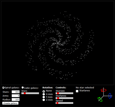
Update: A friend of mine pointed out that the prototype reminded her of a lottery drawing. I don’t think she’s very much into space and science fiction mumbo jumbo or computer games for that matter but she’s got a point. Galaxies don’t look like that! So I added a spiral galaxy generator to the prototype. The code is based on a very good article called “Making Galaxies”. I added the calculation of the third dimension so that the height of the galaxy disk is small in the center and high at the edge.
In spiral galaxy mode you need a lot of stars to actually see a nice galaxy (say 600). The starsize should also be reduced. In case you feel like playing around with the galaxy generator, here’s the testscript I used: galaxy.html.